Takeaways
Importance of user research: Understanding user needs and pain points is crucial for designing effective solutions.
Iterative design: Exploring multiple design options and iterating based on feedback leads to better outcomes.

Technology Intelligence Platform
Designed a centralized knowledge and data portal for organizational use, enabling employees to access critical documents, discussions, and real-time data visualizations. Designed to streamline daily operations, support informed decision-making and provide access to different user groups.
Role: UI Design
Tools: Adobe XD
Team: 01 UX and 02 UI designers
Timeline: 8 months (February 2022 - July 2022)
Objective
To develop a scalable, centralized knowledge platform that enables employees across all roles to efficiently access technical documentation, project learnings, and domain expertise—while fostering collaboration through user-contributed content and leveraging data visualizations to support analysis and strategic decision-making.
Who our target audience are?
The platform was designed to support distinct user groups within the organization, based on their specific roles, responsibilities, and interaction needs with the knowledge base. The segmentation into four core user types—Employees, Management, Analysts, and Admins—was informed by discussions with the client and UX team, who provided direct insights into typical workflows and user expectations across departments.
Employees
General Users
Employees are the primary consumers of organizational knowledge. They require access to documents, discussions, and the ability to contribute insights.
Management
Strategic Oversight
Management personnel need high-level overviews to make informed decisions. This includes insights into repository trends, competitor performance, and organizational metrics.
Analysts
Content Curators
Analysts play a crucial role in ensuring the quality and relevance of the content. They classify, tag, and index resources, making it easier for users to find pertinent information.
Admin
System Administrators
Admins are responsible for the smooth operation of the platform, including user access management and system maintenance.
Personas
The personas were developed through a combination of user surveys, interviews, and analysis of user behavior. By synthesizing this data, we identified common patterns and characteristics that informed the creation of realistic and representative user profiles.

Design Principles
01
Usability: Increase the percentage of users who complete the onboarding process.
02
Minimize cognitive Load: Improve user satisfaction scores from post-onboarding surveys.
03
Engaging: Track the usage of key features post-onboarding.
04
Searchability: Track the usage of key features post-onboarding.
05
Scalability: Track the usage of key features post-onboarding.
06
Functionality: Track the usage of key features post-onboarding.
IA and Navigation Flow
A scalable site architecture and simplified navigation were designed to organize content efficiently and enable users to quickly locate information with minimal effort.


Layout
A modular layout with sticky navigation, section menus, and flexible content containers ensures consistent structure, easy navigation, and scalable component reuse across the platform.
User Flows
Clear and intuitive user flows were created from wireframes to help users complete key tasks—such as contributing content, analyzing data, or participating in discussions—with minimal steps.


Visual Design
At the foundation of this platform’s design was the need to efficiently present dense textual and data-rich content—ranging from documents and tables to charts and discussion threads. Early in our exploration phase, we studied visual strategies employed by benchmark platforms like World Economic Forum’s Strategic Intelligence and Lens.org, both of which effectively deliver complex data through intuitive and scalable visual systems.
Typeface
Roboto
Its mechanical structure and friendly curves, with both precision and readability across dense documents and interfaces makes it an excellent choice fo this project

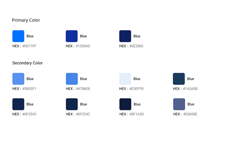
Colors
Harnessing the power of blue and shades of color aligned with the client’s brand to convey trust and clarity, complemented by minimal accent colors for indicators and legends. Subtle gradients and patterns add freshness without overpowering content.


Visual Design
A cohesive design system using a hybrid light–dark theme enhances readability for data-heavy interfaces while maintaining visual clarity, consistency, and reduced user fatigue.
Explorations- Tables
The idea was to create a logical UX framework that would keep the content organised and easy to search for all users. Also, ensure scalability to sustain near future requirements


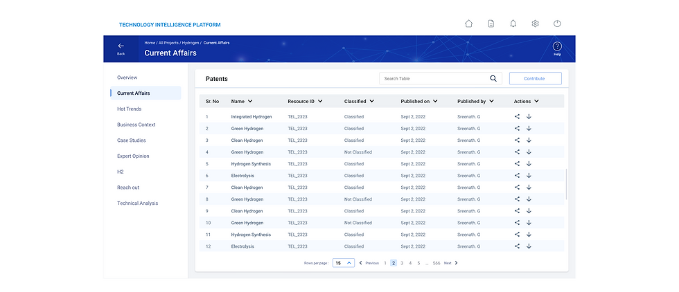

Final UI
Takeaways
-
Designing this platform reinforced the importance of structuring complex information into intuitive systems that enable users to transform large volumes of data into meaningful insights.
-
Effective dashboards are not just about visualizing data, but about helping different user roles quickly identify patterns, trends,
and actionable insights.
-
Consistency through design systems and reusable components plays a critical role in maintaining usability and efficiency across
large, evolving platforms.


